
Post-Figma Design: Real UI, Real Data, Real Impact
What happens when you ditch mockups and prototype directly in code.

I haven’t opened Figma in nearly four months. And I’ve never had more fun designing with greater business impact.
That might sound like blasphemy coming from a design leader, especially one who’s spent the better part of a decade pushing teams to adopt design systems, build scalable UI kits, and optimize prototypes in Figma. But something changed. Or more accurately, everything changed because of AI, smarter dev tools, and a radical shift in how I think about the role of design in startups.
From Artboards to Apps: Designing Where It Matters
Figma is brilliant at many things. It’s accessible, collaborative, and elegant. But in most teams, Figma is the product. Designers obsess over mockups, stakeholders review them as if they were final, and engineering is left to translate pixel intent into real code.
The result?
Redundant work, fragile prototypes, incomplete and out-of-date views of the app, and wasted cycles recreating the same thing — once in design, once in code. It’s death by handoff. And in early-stage startups, that’s a cost you can’t afford.
So I stopped designing in Figma.
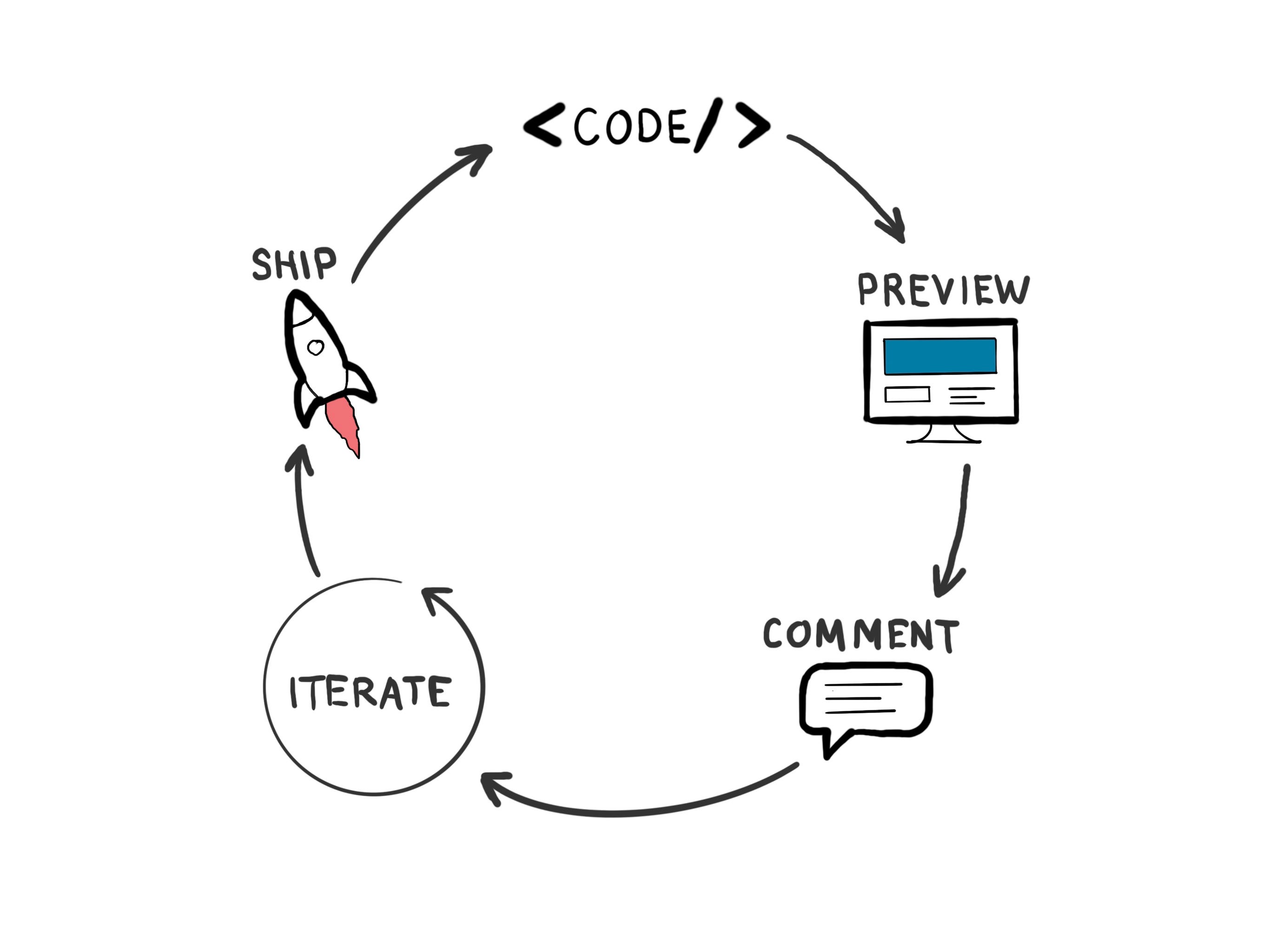
Instead, I started designing in code, using tools like Cursor (an AI-augmented IDE), the Next.js framework, and Vercel’s Preview Deployment and Commenting system.
The experience? Transformative.
Half of the split I described in the following article.

Why This Works (Especially for Startups)
What this setup unlocks is a workflow that’s interactive by default. Every design decision lives in the same environment it will ship in: the browser. There are no assumptions about interactions, no lost states, and no mismatch between redlines and reality. What you see is what the user will see.
Here's how I set it up initially:
Replicate the app shell in Next.js.
Don’t build the whole product. Just scaffold a basic app shell — header, navigation, maybe some layout primitives. This gives you a living canvas.Pick one area of focus.
Choose a specific page or feature you want to improve or validate. Don’t boil the ocean. Solve one problem well, in a way that scales.Pull in your component library.
Use an existing design system from a shared package, or clone it directly into your prototype repo. This gives you instant consistency and speeds up iteration.Use Cursor as your design co-pilot.
Cursor has changed how I work. I describe what I want, which includes layout changes, animations, new flows, and the AI generates code. Sometimes it gets it wrong, but iterating is fast. I'm no longer "coding" in the traditional sense; I'm shaping experiences through conversation with the AI.Share via Vercel Previews.
Push a branch, get a URL. Stakeholders can see the live interaction exactly as it will feel in production, and leave comments like they would in Figma. But this time, you’re not throwing away the prototype later. You’re building forward from it.
The Impact: Less Waste, More Momentum
By moving upstream into code, I’ve found that more of the work is reusable. Instead of spending hours crafting pixel-perfect states that may not match reality, I’m investing in actual layouts, actual components, and actual behaviors that can evolve directly into the product.
And because it’s real, it forces clarity.
Does this filter work with real data?
Does this empty state make sense on mobile?
What happens when the text wraps or the network is slow?
These are the questions designers should be thinking about, and this process makes them unavoidable. Which means better UX decisions, earlier.
It also makes feedback loops faster. You can show engineering something that’s already in the right technical direction. You can run usability tests with something people can click on. You can validate ideas with a fraction of the effort, because you’re not throwing work away anymore.
Design for Reality, Not Just the Happy Path
Here’s something we don’t talk about enough: most apps are not simple flows. They’re full of complexity, edge cases, and unpredictable states. Users rarely experience your product the way your Figma prototype imagines. In the real world, data fails to load. Forms are submitted without the required fields. A search returns zero results. A network request times out. Something breaks.
Designing the happy path in Figma is easy, but designing for reality takes discipline and a knowledge of code, which most designers lack.
When you’re working in code, especially with a working prototype that hits live or mock APIs, you’re forced to confront reality:
What does the UI show when the server returns nothing?
How do we handle error messages?
Is there a skeleton loader, or do we just flash white?
What happens on slow networks or intermittent failures?
Mocking these states in Figma is tedious and often skipped, but in a live, code-based prototype, these states are impossible to ignore. You see them, test them, and design for them. That’s not just better design, it’s responsible design.
Startups, in particular, can’t afford brittle experiences. When you’re acquiring early users, their perception of quality will be shaped more by how you handle the edge cases than by how pretty your core flow looks. Empty states, error boundaries, fallback UI — these are the unsung heroes of good UX. If your product breaks or feels incomplete outside the happy path, users won’t come back.
This new workflow forces you to face those moments head-on. And that makes your product stronger, faster.
Is This for Everyone?
No. This approach demands a different kind of designer. Someone who’s not just comfortable with UI, but with code, logic, and architecture. You need design engineers, or what some call design technologists.

These hybrids are rare, but they are absolute force multipliers in startup environments. They’re the ones who can:
Design an elegant user flow.
Implement it with real data and responsive behavior.
Test it, learn from it, and evolve it — without ever leaving the prototype.
If your team has even one of these people, this workflow is your secret weapon.
Why This Is the Future (For Startups)
Startups don’t have time for waste, and they don’t have the complexity of teams of designers that larger, more established companies and apps do.
Startups need to move fast, test ideas, and ship value. The traditional design pipeline of brainstorm → Figma → handoff → dev sprint → staging is too slow, too lossy, and too reliant on perfect coordination.
By moving to a code-native, AI-augmented design process, small teams can punch way above their weight. You skip the throwaway mockups. You remove the handoff pain. You ship faster and smarter.
The tools are ready. Cursor and Vercel are mature enough. Next.js is flexible enough. AI is powerful enough.
The only question is: are your designers ready?
Final Thought: This Isn’t Anti-Figma — It’s Post-Figma
Figma isn’t going anywhere. It remains the best tool for various purposes, including systems design, early exploration, and cross-team collaboration. But for startups who want to build faster, test smarter, and waste less, there’s another way.
A way that makes design feel more like building.
A way that removes the wall between intention and implementation.
A way that lets a designer create not just mockups, but momentum.
You don’t need to throw out your whole workflow. Just carve out one area. One page. One flow. Start there.
The future of product design isn’t just in better tools.
It’s in better alignment between ideas and implementation. And that future?
It’s already here — just not in Figma.