
Execution Collapsed. Direction Didn't.
I built an iOS app I couldn't have built five years ago. Then I redesigned it into something only I could have made.

Wake up Tuesday morning at 6:12 AM. A push notification from Wren tells me my podcast is ready. Twenty-six articles from my week, stitched into a thirty-eight-minute narrated digest. I built Wren, which is what generated the podcast. This week it spent most of its runtime talking about a single idea.
AI is absorbing execution. Humans are left to set direction.
That's the line I kept coming back to while I listened.
The week Anthropic rewrote the rules
Anthropic shipped seventy-three product releases in fifty-two days. Not prototypes. Not blog posts. Shipped product. The knee-jerk reaction across every feed was “wow, they have great engineers.” This isn’t a talent story, it’s a structural one. Anthropic is using Claude to build Claude. The bottleneck stopped being can we write the code. It became what do we decide to build.
Then they shipped Claude Opus 4.7, which handles engineering tasks its predecessor gave up on immediately followed by shipping Claude Design, which generates interactive prototypes from a paragraph.
Three different signals. One story.
The work of translation, the work of execution, the work of turning someone else’s idea into a tangible thing: that work is getting absorbed. What’s left is architecture, judgment, and taste.
For designers, this is not a threat. This is the gift you’ve been waiting for.
The pixel-pushing epoch is over
Be honest with yourself about what most “design work” actually was.
Translating a PM’s PRD into a Figma file. Building the fifth variant of a card component so leadership could feel like they “saw options.” Making the happy path beautiful and hoping engineering figured out the empty state.
All of that is gone or going.
Claude Design reads your codebase, absorbs your existing design system, and produces work that looks like your brand in a single prompt. Claude Code reads your spec and ships the feature. Opus 4.7 holds a multi-hour refactor together without you hovering over it. The translation layer, the thing a whole generation of designers built their identity around, collapsed this quarter.
Here’s the part most designers haven’t fully processed: the collapse isn’t a threat to your job. It’s a threat to the parts of your job you were always a little annoyed to be doing. The mechanical parts. The translation parts. The “I’m the only person in the room who can do this, so it falls to me” parts.
What’s left is the part that was always more valuable. Knowing what to build. Knowing what the thing wants to be. Holding the standard when the model offers you the generic answer. Deciding.
Which brings me to the app.
What Wren looked like before
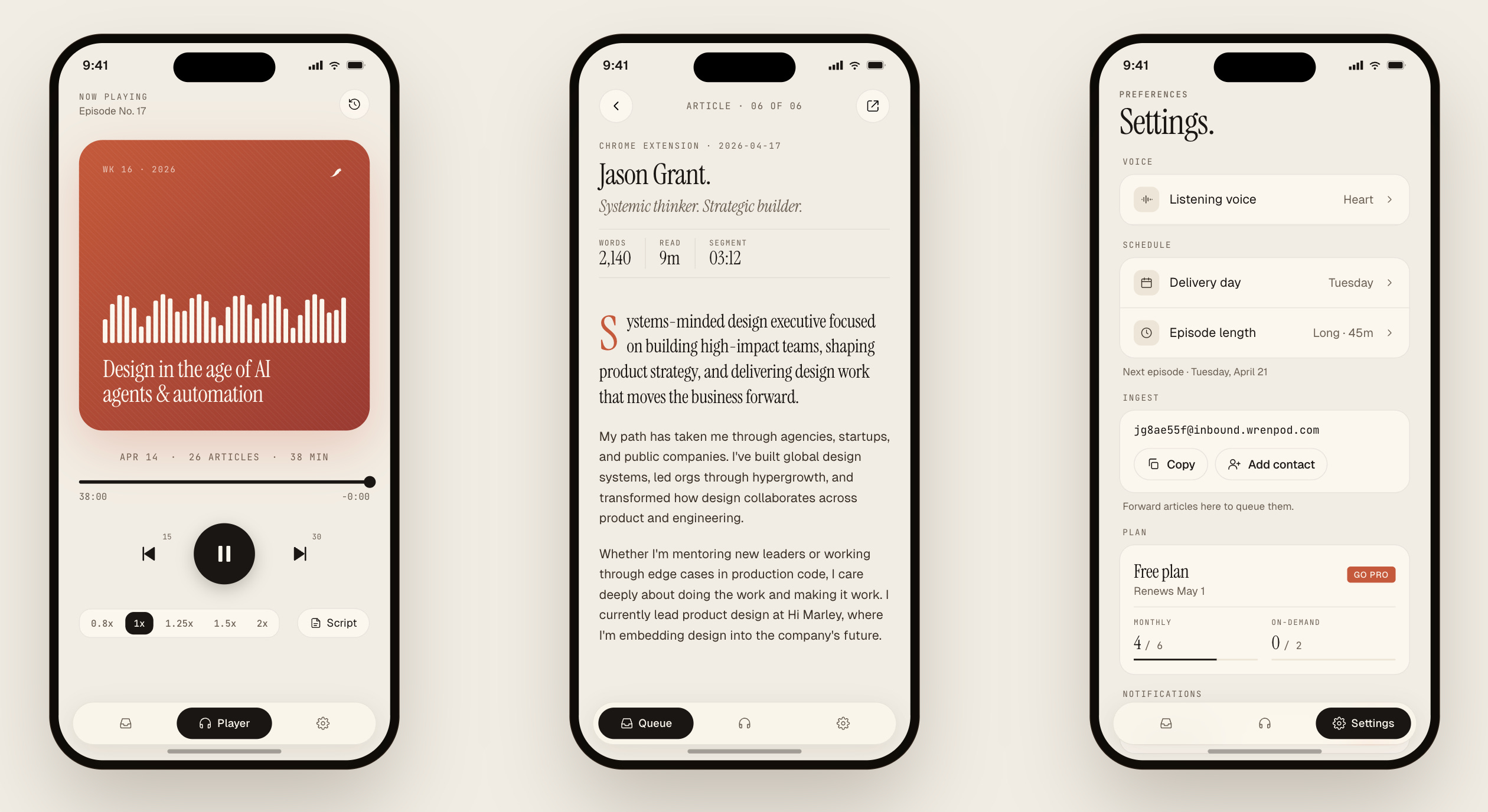
Wren is an app I built that turns my saved articles into a weekly podcast. I forward newsletters to a unique email ingest address, share links from other iPhone apps, or clip content using a Chrome extension. On my selected podcast day, in the morning it delivers a forty-five-minute episode stitched from my week, read in a voice I chose.
The stack: Claude Code for most of the Swift, Speckit for scaffolding, Xcode to ship, a Chrome extension for article capture, Supabase for auth, Railway for the backend, Vercel for website. I am not primarily an iOS engineer. Five years ago this app does not exist because I cannot build it alone. Today it exists because the execution layer collapsed underneath me.
The first working version looked like many other iOS apps. Default components. System blue buttons. Gray list rows. Headphones icon dragged in from SF Symbols.
It worked. It was functional. And it was completely soulless.

I could have shipped that. Plenty of people do. That’s the version AI gets you to in an afternoon, and the version most indie apps settle for because “design” is somebody else’s discipline.
That version is not the job.
What Wren is now
Here’s the question I asked after I stopped being impressed that the app existed:
What should Wren’s personality be?
Not “what should this screen do.” Not “what component should this be.” The bigger question. The one no model will ask for you.
The answer came from the product itself. Wren is a songbird. The product turns text into voice. What it competes with isn’t other iOS apps. It competes with magazines, newsletters, and radio. The lineage is editorial, not productivity. Blue says software. Paper says reading. Glass says dashboard. Stock says digest.
That single commitment rewrote every surface.
The background became warm paper, not white. The type system is three voices doing three different jobs: Instrument Serif italic for display, Geist for UI, JetBrains Mono for metadata. One terracotta accent, reserved for primary action, replaces the entire iOS system palette. Headlines earn full stops. The queue is a table of contents, not an inbox. Numbers breathe. Hairline borders, soft corners, no heavy strokes, no gradients, no bounce.
Twelve screens redrawn. Four queue states treated with the same editorial care, because empty and offline deserve the same type discipline as ready. A style guide written alongside the screens, not after. Seven rules of thumb I can fall back on the next time I add a feature, so the system flexes without falling apart.
None of that work was execution. All of it was direction.
Claude Code could not have told me that Wren wanted to look like a magazine. It could not have told me that paper beats glass for a reading product. It could not have told me to ban the iOS system blue. Once I made those calls, AI helped me ship them in days instead of months. But the calls were mine.
That is the whole bargain right now.
Design systems were the rehearsal
Most designers still think AI coding tools are for developers. After building four design systems over the last ten years, I’d argue the opposite.
The first was Angular v1, built before “design system” was even a phrase people used, scaffolding for sales demos that doubled as a way to accelerate engineering. The second was in web components, solving the multi-framework problem before anyone had a clean name for it. The third was React, at a pre-IPO company carrying enough tech debt to sink the ship, and it’s part of why they made it to market. The fourth is the one I’m building now, trying to answer a different question: what does a design system look like when prototyping, design, and engineering all run through AI?
Every one of those projects taught me the same lesson.
If you’ve ever built a design system, you already know how to do this.
Building a design system taught me to think in constraints. What are the rules this component follows? Where does this pattern break? What’s the one decision that unlocks ten others? You build a token once. You spec a spacing scale once. You document a button once. Every screen after is a composition of decisions already made.
That is exactly how you work with AI tools.
When I started using Claude to ship real Swift, something clicked immediately. Not because I’d gotten better at prompting. Because I already knew how to think about interfaces as systems. The model is fast and confident. It needs someone who can see the structure underneath the surface and hold it steady while the code flies.
AI doesn’t replace design thinking. It amplifies it.
The people getting the most out of these tools aren’t the best coders. They’re the ones who can name a constraint, hold a rule, and spot the moment the generic answer breaks the system. That’s every designer who has ever fought for a consistent radius scale or killed a one-off variant.
If you’ve spent time on tokens, components, patterns, and rules, you are more ready for this moment than you think.
The only question is whether you’ll start.
The job that remains
For the last decade, being a good designer meant being the person in the room who could open the right tool and make the idea real. That made pixel speed a proxy for talent. It is not anymore. Every founder, every PM, every engineer can open Claude Design and get a polished first draft of the idea in ten minutes.
Your advantage is not that you can make it real. Your advantage is that you can see clearly enough to decide what it should be, and then hold the standard while you build it.
This is why “designers who build win” is not a slogan about learning to code. It is a description of the only remaining competitive surface. Taste plus judgment plus the agency to ship. If you have all three, the execution layer collapsing is the best news of your career. If you only have taste, you are about to compete against founders with Claude Design subscriptions, and it is going to be uncomfortable.
The hiring managers already know this. They want people who can orchestrate across workstreams, apply judgment about when to intervene, and bring taste to the decisions the agent can’t make. The editor archetype, the person who picks the best of ten options, is being retired. The conductor archetype is taking over.
The designers who win in 2026 are not the fastest in Figma. They are the ones who can read a product’s soul clearly enough to direct it, and are willing to build it themselves now that the machine finally gives them the agency to ship.
Your move
For me, the answer was Wren. An app I couldn’t have built five years ago, redesigned into something only I could have made. The execution layer collapsed, and the remaining work turned out to be the work I actually wanted to do.
Whatever idea has been sitting in your Notes app for two years, the one you told yourself you couldn’t build. The execution layer for that idea just collapsed too.
What are you going to do about it?