Case Study: Contrast Checker
Building an integrated, clutter-free tool for accessible contrast
Background
Checking contrast is a foundational practice to ensure content readability and inclusivity. Existing tools help meet the WCAG (Web Content Accessibility Guidelines) standards, which are widely accepted across the industry. However, with emerging standards like WCAG 3 and the Accessible Perceptual Contrast Algorithm (APCA), a new method is gaining traction in accurately predicting readability contrast. While APCA is not yet mandatory, it offers a promising approach to better model perceptual differences and readability on self-illuminated screens. APCA is derived from the SAPC (S-LUV Advanced Predictive Color) model and is designed to improve readability contrast calculations on self-illuminated displays, particularly for dynamic and digital environments.
The Problem
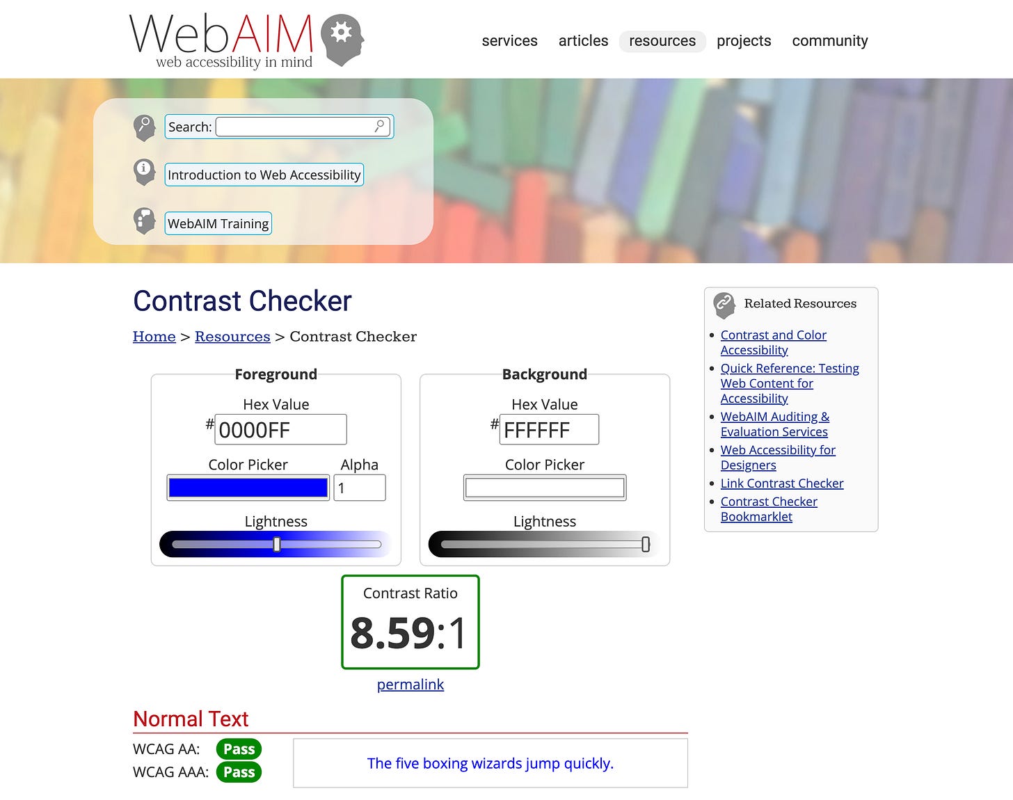
I often found myself jumping between various contrast-checking tools to validate designs. Many of these tools focused exclusively on either WCAG or APCA, lacking the ability to address both standards comprehensively. Adding to the challenge, existing contrast checker interfaces were clunky and reminiscent of websites from the early 2000s, filled with unnecessary elements. They had colorful, noisy, ad-like layouts, undermining the user experience with excessive visual clutter. These prompted me to envision a more streamlined solution.
Solution
I created an all-in-one contrast checker tool that combines WCAG and APCA standards in a clean, modern interface.
Unified Functionality
Integrate WCAG and APCA contrast assessments to provide users with a single resource for evaluating readability. This combination would offer a broader scope of insights, even if APCA isn’t widely adopted, as it provides valuable perceptual data for enhancing design readability.
Modern, Minimal Design
The interface is intentionally minimalistic, emphasizing the data over decorative elements. I eliminated unnecessary visual clutter, opting for a streamlined, intuitive layout that allows users to access WCAG and APCA results without distractions.
Clear, Actionable Data Presentation
The data is displayed in an organized manner, guiding users through the accessibility requirements. Each result, WCAG compliance, and APCA readability prediction includes actionable insights designers can use to adjust quickly. I also designed interactive color inputs and previews, enabling users to see adjustments in real-time and understand the implications of contrast changes on their designs.
Special thanks
Thanks to Sondre Aasemoen for creating an a11y-color-contrast library, a Typescript implementation of both the WCAG and APCA contrast algorithms. Sondre’s work provided an invaluable foundation for the project, allowing me to streamline the integration of these algorithms into a unified tool. His contribution saved me countless hours of development and ensured that the tool could deliver accurate, standards-compliant results.


